


 Showrooms
 Contact
 My Account
 Track Your Order


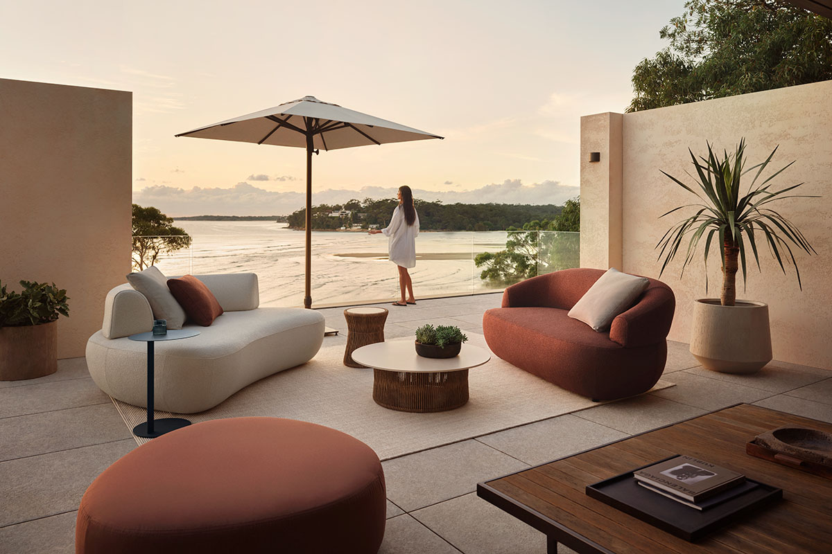

Late afternoon on the terrace, the light turning gold, drink in hand. This is when an outdoor space feels like home.
Indoors, we reach for colour without thinking. Cushions, throws, a rug, a wall in a warmer shade. It shapes how a room feels and how we use the space. Outdoors, most of us stop at the furniture, but colour can carry the mood of your interior past the threshold, creating a seamless connection between inside and out.
This article explores three ways to style with an earthy colour palette, each drawn from the natural landscape. Layer them with texture, and your outdoor living space feels as warm and considered as the rooms inside.

1. Calming neutrals: Sand and stone
Best for: a versatile base that suits any space
Neutrals feel grounding for a reason. Warm, muted tones echo the natural colours of sand, soil and stone, creating less visual contrast and a calmer overall setting. But without enough variation, a neutral palette can quickly feel flat. These styling tips will help bring warmth, depth and definition:
- Anchor the largest elements in neutral
Keep light brown, muted stone and warm tones on the outdoor sofa and rug, where they cover the most ground and set a calm base.
- Layer the shades, do not match them
Vary sand, oat, taupe and stone so the neutrals read considered rather than flat. Two or three shades in one tonal family is enough.
- Warm the light after dark
Neutrals turn cold under bright white bulbs outdoors, so choose warm lights or lanterns to hold the golden warmth into the evening.

Standout tip
Lighter tones can show stains and wear more than most, so the fabric has to hold up. Here, the 1977 Outdoor Sofa is styled in Zenith Sable, a soft, earthy shade made for outdoors. Water and fade resistant, the colour stays true through long afternoons of sun and heavy winter showers.

2. Warming up: Russet and burnt orange
Best for: bringing colour and energy outdoors
Russet is a deep, earthen red inspired by the Australian outback. With brown and burnt orange undertones, Russet deepens a space without darkening it, making it ideal for anchoring small and large spaces. But like many warm, saturated colours, it can be more challenging to balance. These styling principles will help you work with Russet confidently:
- Let it accent, or let it lead
As a hero, a sofa in russet has a bold effect, while keeping the setting warm and relaxed. This is ideal if you’re wanting to make a statement with your outdoor design. As an accent, a cushion or ottoman in russet adds depth to a neutral base, a perfect choice if you’re just beginning to experiment with colour.
- Repeat it in odd numbers
A single moment of russet can read as an afterthought. Scatter it across three or five points, spread evenly rather than grouped, so it carries the eye through the setting.
- Pair it with its natural partners
Russet sits beautifully against beige and oak because warm neutrals are from the same earthy family. Styling these together lets the richer colours pop rather than overpower.
